

What makes a therapy website feel welcoming, trustworthy, and easy to navigate? I spent time exploring therapist websites across Ottawa to find out.
Looking Beyond Design
As a website designer who specializes in helping service-based businesses, I often spend time exploring websites within a particular industry. It helps me better understand what potential clients experience when they’re searching for a service.
Recently, I explored therapist websites across Ottawa.
This wasn’t about deciding which websites were “good” or “bad,” and it certainly wasn’t about ranking practices or critiquing other designers’ work. Every practice has different goals, budgets, and priorities. A website that works well for one therapist may not be the right fit for another.
Instead, I wanted to look for patterns.
What information was easy to find? What helped build trust? What made the experience feel calm and welcoming? What questions did I still have as a visitor?
Here are the themes that stood out to me.
At a Glance
After reviewing therapist websites throughout Ottawa, these were the most common patterns I noticed:
- Calm, welcoming visual design
- Simple navigation focused on helping visitors find information quickly
- Strong emphasis on the therapist’s approach and values
- Authentic photography that creates connection
- Thoughtful use of whitespace and typography
- Clear calls to action
- Educational resources and blog content
- Mobile-friendly layouts
- Consistent branding
- Opportunities to answer more practical client questions
Let’s look at each one.
1. First Impressions Matter More Than Fancy Design
One thing became clear almost immediately: the strongest websites weren’t necessarily the most elaborate.
They simply made visitors feel comfortable.
Soft colours, generous spacing, approachable language, and authentic imagery all helped create a sense of calm before a visitor had even read much of the content.
For someone looking for therapy, reducing stress from the very first click is incredibly important.
My observation
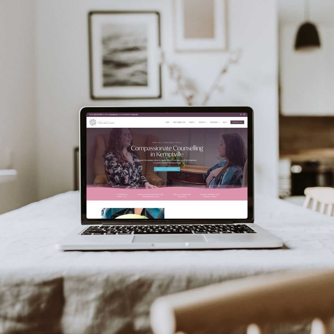
The websites I spent the most time on weren’t the ones with flashy animations or complex layouts. They were the ones that immediately made me feel welcome. Clean typography, generous whitespace, calming colours, and thoughtful photography created an environment that reflected the care someone might expect from the therapist themselves. It reminded me that great design isn’t about impressing people—it’s about putting them at ease.
2. Simple Navigation Creates a Better Experience
Most therapist websites didn’t overwhelm visitors with dozens of menu items.
Instead, they focused on helping people quickly answer questions like:
- Who do you help?
- What services do you offer?
- How do I book?
- Where are you located?
- What should I expect?
Simple navigation reduces decision fatigue and helps visitors feel more confident moving through the website.
My observation
As I moved from one website to the next, I noticed that I appreciated menus that stayed focused. When navigation became too detailed or included too many dropdowns, I found myself pausing to figure out where to click next. The websites that felt the easiest to use usually had straightforward navigation and clear pathways to the information I was looking for.
3. The Best Websites Clearly Explain Who They Help
One of the biggest differences between a good website and a great one is clarity.
Rather than speaking broadly about therapy, the strongest websites helped visitors quickly recognize themselves.
Whether someone is looking for support with anxiety, trauma, relationships, parenting, ADHD, grief, or life transitions, specificity helps visitors feel understood.
The easier it is for someone to think, “This therapist understands exactly what I’m going through,” the easier it becomes to take the next step.
My observation
I found myself connecting more with websites that spoke directly to specific experiences rather than trying to speak to everyone. Clear language helped me understand who each therapist was best suited to help and made the practice feel more approachable.
4. Authentic Photography Builds Trust
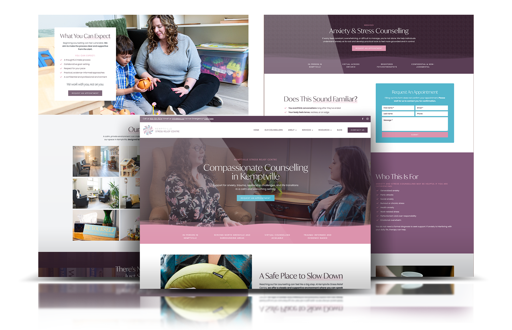
Professional photography appeared on many of the websites I reviewed, but the most memorable images weren’t overly polished.
Warm smiles.
Comfortable office spaces.
Natural lighting.
Simple moments.
These images helped create a feeling of familiarity before a first appointment had even been booked.
My observation
The photographs that stayed with me weren’t perfect studio portraits. They felt genuine. Seeing a therapist in their office, smiling naturally or simply looking approachable, helped me imagine what meeting them might actually feel like. That personal connection is difficult to create with stock photography alone.
5. Educational Content Helps Visitors Feel More Confident
Many practices are investing in helpful articles, guides, and resources that answer common questions.
This kind of content serves two important purposes:
- It helps potential clients feel informed.
- It demonstrates expertise without feeling promotional.
It also supports long-term visibility in search engines and AI-powered search experiences.
My observation
I appreciated the practices that invested time in educating visitors rather than simply describing their services. Helpful articles, FAQs, and guides answered questions I hadn’t even thought to ask and demonstrated a willingness to support people before they became clients.
6. Mobile Experience Can’t Be an Afterthought
Most people searching for a therapist today are doing so on their phone.
That means websites need to be easy to read without zooming, buttons should be large enough to tap comfortably, and important information should appear early.
Small improvements in mobile usability can make a significant difference in how welcoming a website feels.
My observation
When viewing websites on a smaller screen, I quickly noticed how much spacing, button size, and text hierarchy affected the experience. The best mobile websites didn’t feel like scaled-down desktop versions—they felt intentionally designed for someone browsing on the go.

7. Visitors Appreciate Practical Information
Beyond learning about therapeutic approaches, visitors often have practical questions.
For example:
- Do you offer virtual sessions?
- Are you accepting new clients?
- What are your fees?
- Is parking available?
- What should I expect during my first appointment?
Answering these questions upfront can reduce uncertainty and help visitors feel more comfortable reaching out.
My observation
One thing I noticed while browsing was how often I found myself searching for practical information. Sometimes I wanted to know whether sessions were virtual or in person. Other times I wondered about fees, availability, or what the first appointment looked like. When those answers were easy to find, the entire experience felt more reassuring.
8. Consistent Branding Builds Confidence
Strong branding isn’t about using bold colours or elaborate graphics.
It’s about consistency.
When typography, colours, imagery, and messaging all work together, the experience feels more professional and trustworthy.
Consistency helps visitors focus on the information instead of being distracted by the design.
My observation
The websites that felt the most polished weren’t necessarily the most expensive-looking. They simply felt cohesive. Every element seemed to belong together, creating a quiet confidence that reflected the professionalism of the practice.
9. Small UX Details Make a Big Difference
Sometimes the smallest decisions create the biggest improvements.
- Clear headings
- Comfortable spacing
- Readable fonts
- Logical content flow
- Buttons that stand out
These seemingly minor choices help visitors move naturally through the website and find what they’re looking for without frustration.
My observation
Some of my favourite websites weren’t memorable because of one standout feature. They were memorable because nothing got in the way. Information was easy to scan, sections flowed naturally, and I always knew what to do next. Great user experience often feels invisible because everything simply works,
10. Every Website Reflects the Therapist Behind It
Perhaps my biggest takeaway was this:
There isn’t one perfect therapist website.
Every practice has its own personality, values, and approach.
The strongest websites didn’t look identical.
They simply felt authentic to the people behind them while making it easy for visitors to understand who they help and how to get started.
My observation
By the end of my review, I realized the websites I remembered most weren’t the ones with the fanciest designs. They were the ones that gave me a genuine sense of the therapist as a person. Their values, approach, personality, and philosophy came through naturally, making the experience feel personal rather than transactional.
What I Learned
After spending time exploring therapist websites across Ottawa, I was reminded that successful websites aren’t about following the latest design trends.
They’re about creating an experience.
Someone looking for therapy may already feel overwhelmed, uncertain, or anxious. A thoughtful website can reduce some of that uncertainty by answering questions clearly, creating trust, and making it easy to take the next step.
What stood out most wasn’t a particular colour palette, layout, or navigation style. It was intention. The websites that left the strongest impression were the ones designed with empathy, clarity, and the visitor’s experience in mind.
That’s ultimately what great user experience is all about.
Frequently Asked Questions
What makes a therapist website effective?
An effective therapist website helps visitors quickly understand who you help, what services you offer, and how to book an appointment. It should feel welcoming, easy to navigate, answer common questions, and build trust before someone ever reaches out.
Should therapists have a blog?
Yes. A blog or resource library can answer common client questions, demonstrate your expertise, improve your visibility in search engines, and help AI-powered search platforms better understand the topics you specialize in.
How important is SEO for therapists?
SEO helps therapists become more visible when potential clients search online for services in their area. A well-structured website with clear service pages, helpful educational content, local keywords, and strong user experience can improve both discoverability and trust.
What pages should every therapist website include?
Most therapy websites benefit from having a homepage, about page, services page, therapist profile(s), fees or FAQ page, contact page, and a resource library or blog. Depending on the practice, pages for specific specialties or treatment approaches can also help visitors quickly find relevant information.
Why is user experience important for therapy websites?
Someone looking for a therapist may already be feeling vulnerable or overwhelmed. A thoughtful user experience removes unnecessary friction, answers important questions, and helps visitors feel comfortable enough to take the next step.
Thinking About Refreshing Your Therapy Website?
If your website no longer reflects the quality of care you provide, or you’re wondering how it could better support your practice, I’d be happy to help.
My approach combines thoughtful strategy, user experience, search visibility, and custom WordPress design to create websites that feel welcoming, build trust, and support long-term growth for your practice.
Whether you’re planning a complete redesign or simply looking for a fresh perspective, I’d love to help you create a website that reflects the care you provide every day.
Browse The Post